
CASE STUDY
Proteção em Rede
How design can help children and adolescents victims of sexual violence.
UX / PRODUCT DESIGN

About the client
Centro 18 de Maio, is a public place of integrated and humanized care for children and adolescents who are victims of sexual violence, aiming at full protection in Brasilia – Brazil.
Only in the first year of operation, more than 1300 cases have been registered in the city of Brasilia.
Market: Brasília | Brazil

Project Summary
Proteção em Rede is a software we developed especially for the Centro 18 de Maio for the care of children and adolescents victims of sexual violence.
This was the project with the most significant impact on which I had the opportunity to work. I was invited to lead the Software Design and it was gratifying to see how design decisions can help to protect and even save lives of children and adolescents.
Project Details
Client Name
Centro 18 de Maio | Instituto INDICA
Project duration
6 Months
Devices
Desktop / Tablet / Smartphone

The Job
To develop a software to perform all case and process management for children and adolescents victims of sexual violence. The goal was to reduce length of service time and production of the technical report.
My Role
UX Researcher / Product Designer / Project Manager
What I did
UX Research, prototypes and responsive Software Design according to user needs and business goals, through Lean UX and Agile Methods.
In addition, I also managed the project and development team.
The Results
Proteção em Rede helped make the entire service process faster. It also facilitated the communication and exchange of information about a case between public officials.
The Software has enabled a reduction by 42% in service time. Another huge benefit was that users can now generate Psychosocial Report in just 1 day instead of 15 days as it was previously.

Design Thinking Process
Check out the process of this project and see how we achieve the final result.
In this case study, I demonstrate how the research, ideation, prototype, testing, and development phases were conducted.
Reading time: 8min
Design process:
Together with my teammates and in order to learn to the utmost about the behavior and attitudes of users, besides engaging them in the Design process, we decided to follow the NN Group Design Thinking Process. This methodology allowed us to quickly evaluate design hypotheses and functionalities in the prototype and test phase and optimize the time during the development phase. We worked side-by-side, and while an area or functionality of the software was already validated and being implemented, I sketched, prototyped, tested, and validated new features and ideas with users.

Understand
Understand users and problems
Empathize
At the beginning of the project, we immersed ourselves in the project: we held meetings with stakeholders, in addition to getting to know the Center, its structure, and follow the routine of a case.
Workflow Mapping
The first step was to map and identify the workflow in order to understand how tasks and actors involved in the process. This step was fundamental to having a macro view of the project.

Empathy Map
After some users interviews, I synthesized the information by creating an empathy map in order to keep the sensitivity we’d gained from the research.


Persona
We needed relatable way of relating to our users without having to be too abstract, so based on the user research I set up two personas. I referred to them throughout the entire product development process.
Being able to recall the behaviors and motivations of our users in such a quick way proved useful when we would get stuck or if the team had a disagreement about a particular design decision.
These artifacts provided us with a point of reference which we could return to anytime we needed to remind ourselves who we were designing for.

Each persona had a scenario that identified a realistic goal the user might have when using this software.
The information about each persona focused on its goals and frustrations with the product as well as their interaction with it, which drastically affected my design decisions.

User Journey
Armed with a list of primary pain points for our users, I conducted a few more interviews with an updated table of questions to gain context around said pain points.
From there I took all of findings and created a user journey map with emotional states and thoughts annotated for each persona.

Define
After all the research and interviews carried out and with an understanding about our users and needs, the time has come to define the pains and problems to be solved.
Prioritizing-pain-points
I had already mapped out several pain-points but could not decide alone on the direction, so I chose to send out a survey via email / Link to the stakeholders to rate each point we identified by importance on a scale of 1-10.
In possession of the results I created an array of pain-points that was presented to all Stakeholders. This was revised and adjusted with the presence of all. In this meeting we defined through voting what would be the points that would be focused on the MPV and in a second release.
MVP: Marked in blue dots
V2: Marked in red dots


Sitemap / Mind Map
After the definitions of users and tasks, we already had the necessary inputs to perform the sitemap and a mindmap of the solution to be developed.
I created a software mindmap. It is a great way to get a macro view of the solution, interaction, and permission levels of user profiles, as well as enable rapid client understanding.

Organization and Project Management
As I worked also as a project manager, I also developed the work schedule for stakeholders involved to have an easy way to follow the evolution of the project. These graphs was constantly adjusted in a new version, so we could analyze what was proposed and what was actually executed, giving a clear vision about the execution of the project.


Explore
Be crazy, be bold and make it
Ideate
Paper Prototype
After defining the problems to be solved and project priorities, it was time to outline some ideas and hypotheses to quickly validate which ideas worked best and dictate the solution path. As one of the goals was to be able to use the software on tablets during the service, I did the paper sketches in tablet format to validate their use. I created some user stories and validated with 3 users.

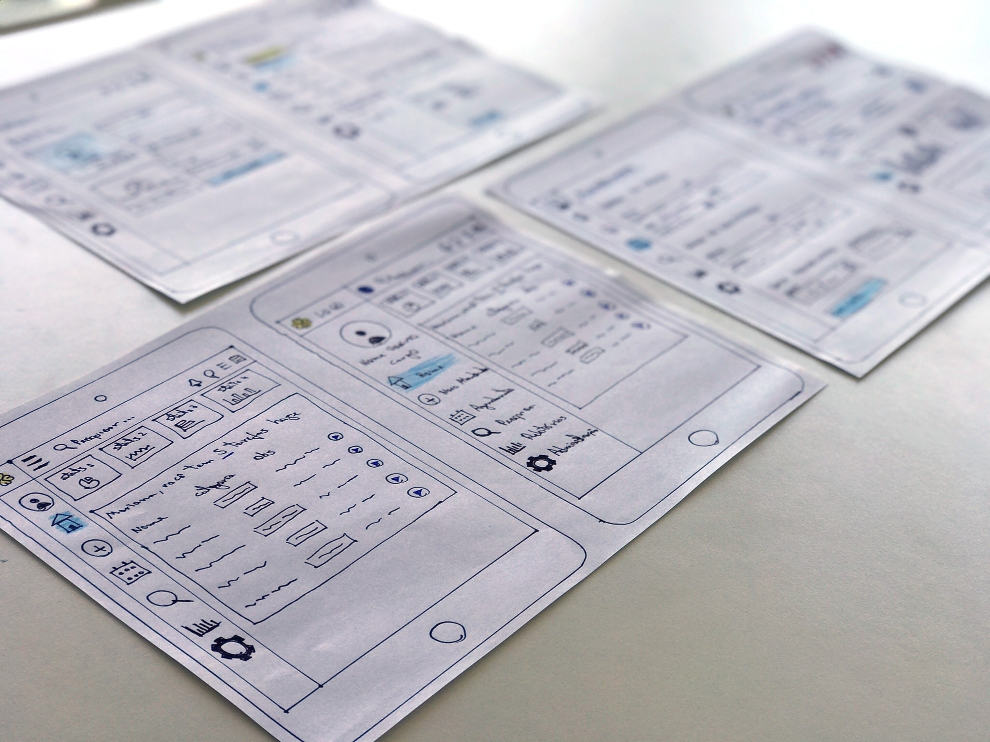
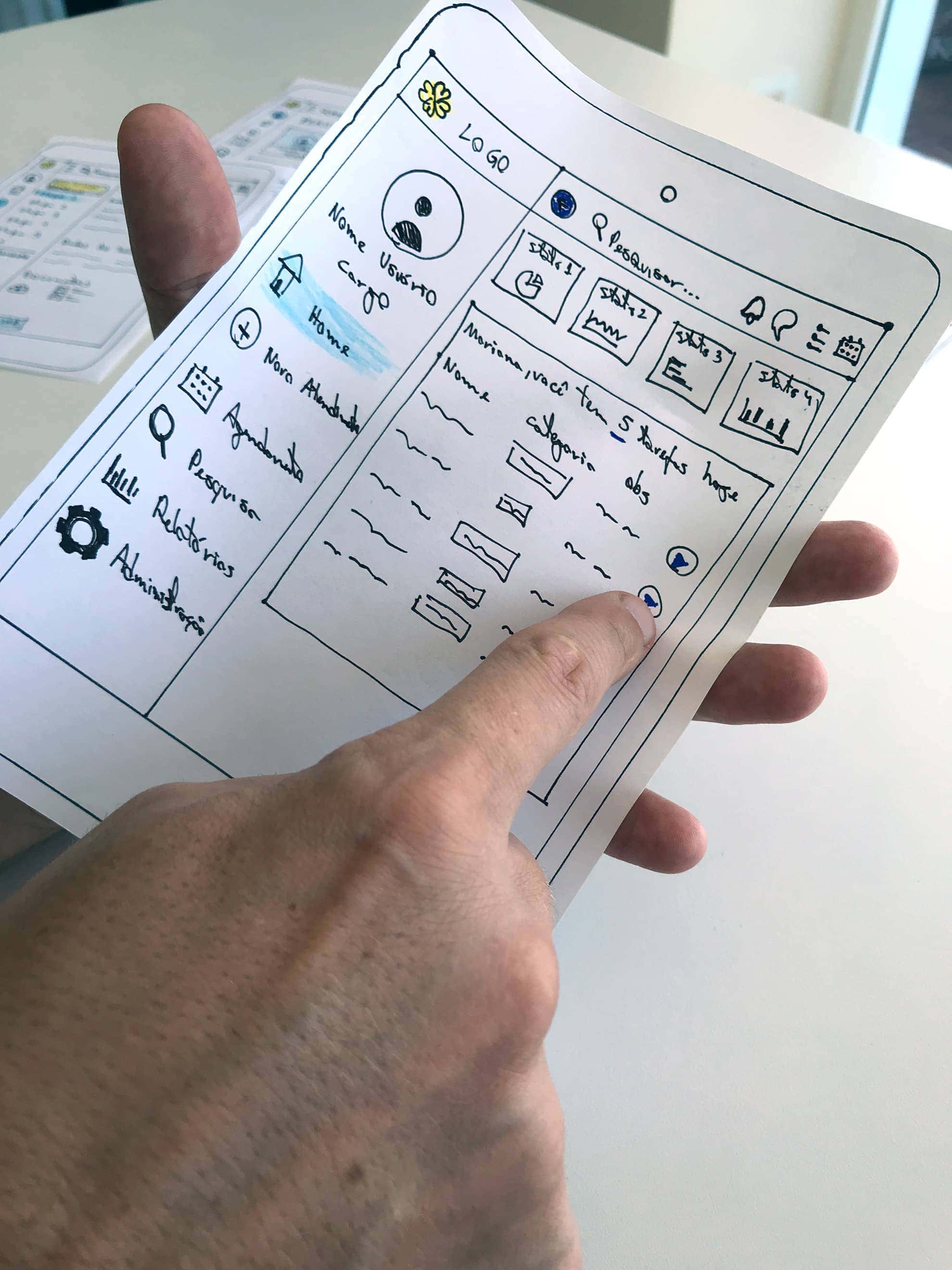
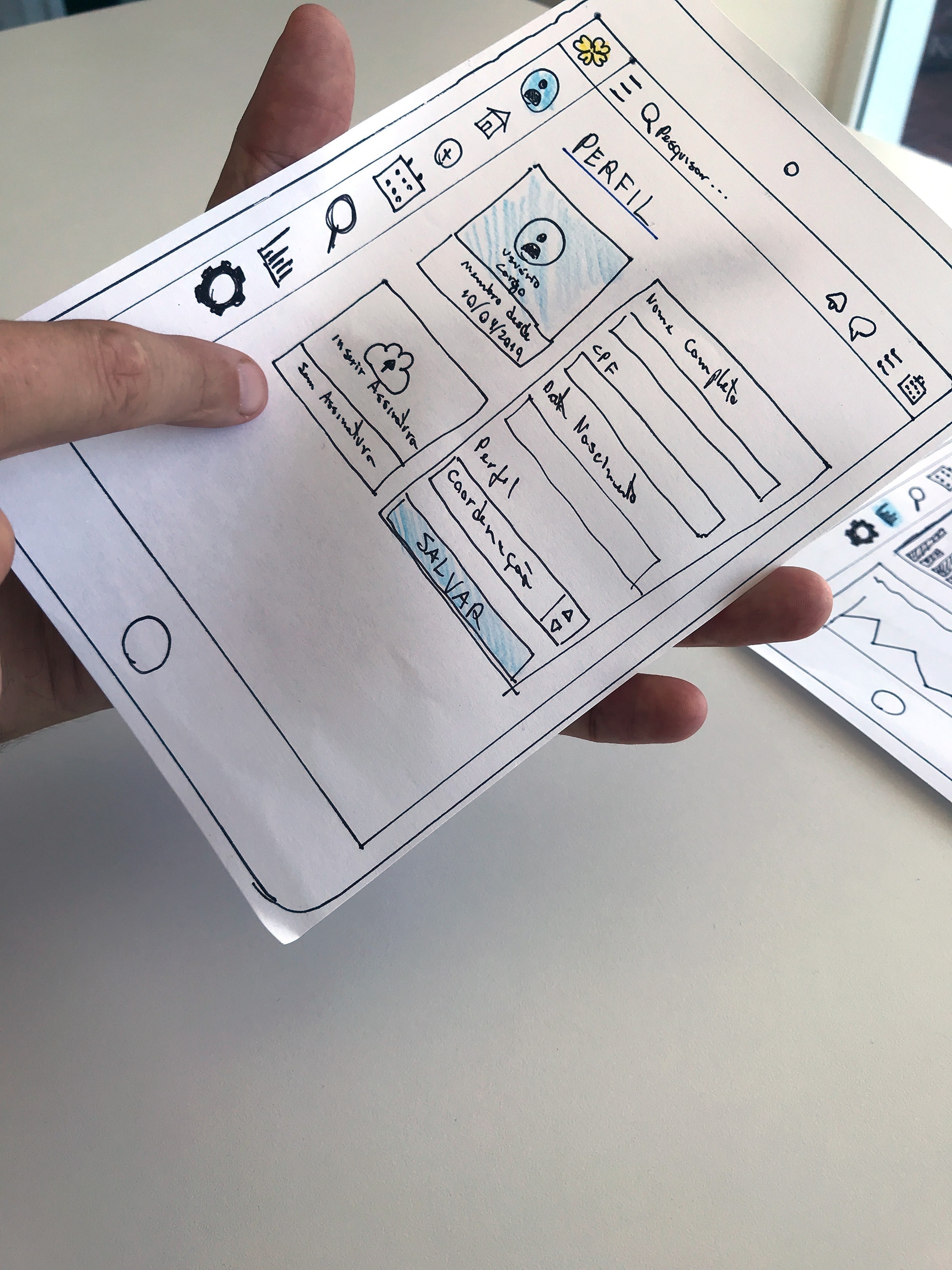
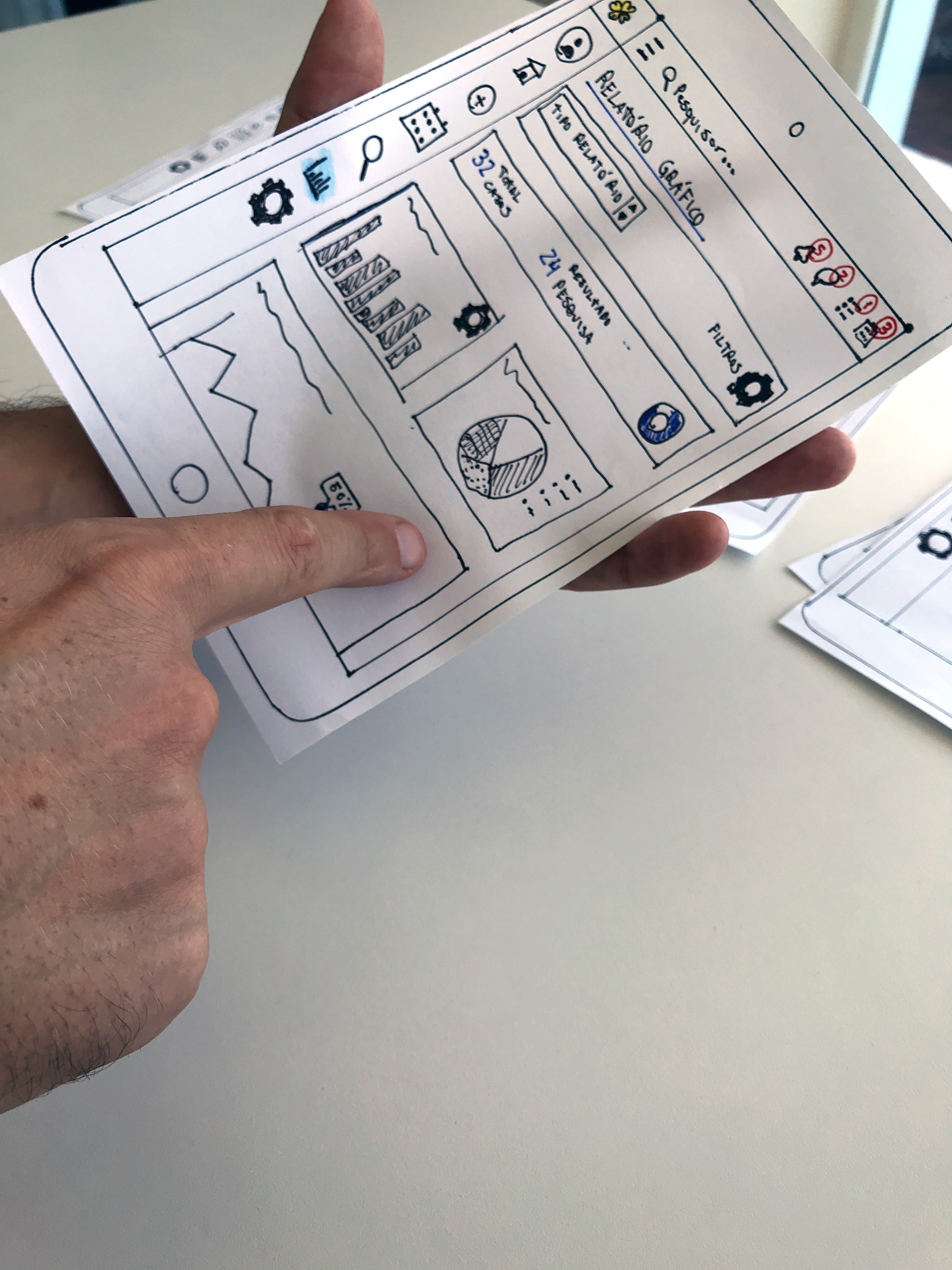
It was a phase of high collaboration and co-creation with users. In some cases the users drew some suggestions and features directly on the papers.
Findings
- The users approved the idea of using the tablet and gave several insights of improvements to structure the solution.
- Users need more space for content while using tablets
- We had some very good insights for the Schedules screen to improve the experience of it
Design Solutions
- Minimalist, flexible and responsive navigation to provide better use of screen space
- In the schedules, I include the option to show the available dates directly in the calendar
Prototype
Axure RP was the software chosen for the development of the prototype. It allows interactions in Browser with complex form interactions, database simulation, variables, logic conditions, auto-complete tests, real time filters among other features that we need to validate. It was fundamental to the development team, who could see what was the behavior of each element along with the technical information.
Medium-fidelity Prototype
I’ve turned my revised sketches into an interactive black-and-white prototype. The basic elements of UI, hierarchy, and visual pattern have been defined. In this step we have already tested and validated the use of the prototype in Desktops and Tablets, which were the focus of the project. I have tested the prototype with users in person and in some cases remotely.
Tablet Version:

Desktop / Laptop Version:

The interaction with the users was fundamental and provided several improvements and adjustments.
Findings
- Users wanted a cleaner version of the initial dashboard with the daily most important information for each User, such as: Today’s Schedules and Today’s Tasks. Specific graphics and statistics should only be maintained on the graphical reports page
- Users wanted more filter options on the search page
- Users wanted to know quickly which Schedules should be confirmed
- Better data reuse for the forms of a case
- Users wanted an easy access for registration, monitoring and psychosocial report in a case
Design Solutions
- An advanced filter bar was provided on the search page with several improvements
- The specific reports that were on Home have been moved to the Graph Reports page
- A new page has been created, Schedules that allows to easily identify which schedules need to be confirmed, for “today”, for “the next 7 days”, late, etc.
- Several design enhancements to facilitate the filling and re-use of information provided in a case
- We put all the data of registration, monitoring and elaboration of the psychosocial report within the attendance of a case
Design System

At this moment I have structured the Design System into and updated according to the approved visual identity.
The Design System was essential to speed development in the prototype of the missing screens. I structured the elements according to Atomic Design, idealized by Brad Foster. This method also accelerated adjustments and fixes in visual design and made life easier for developers.

Hi-fidelity Prototype
After several rounds of improvements, it was time to make a Hi-fidelity Prototype with the approved visual identity to deliver the experience to users as close to the real software as possible before we moved on to the development stage.
High-fidelity prototypes have been developed for Desktop, Tablet and Smartphone.

All screens were developed to be tested on the different devices.

Even though the focus of use was on laptops and tablets, I also developed a version for Smartphones, which proved to be very useful for the Persona Juliana (Coordination profile).

The hi-fidelity prototype was ready to be tested.

Materialize
Be humble and get it done
Test
We tested the versions with the users on all the devices. We made face-to-face and remote tests and allowed us some more adjustments until we reached the solution that met the expectations of the users.

Findings
- Managers users wanted a greater focus on reporting in the mobile version and approved the idealization provided
- Users needed to add siblings who also were victims to the same case
- Another need was to be able to insert the Family, Victim and Institution reporting information in a way that facilitated the completion and comparison of the data
- Users wanted a quick way to identify which screens had already been filled and how much (%) has been filled of a case
- Audit trail needed to be easier to view and understand
Design Solutions
- I added a form group for each Victim and a button at the end to insert a new form for each new sibling. At this stage I had to modify various information and how they were distributed and grouped by each victim.
- I created a card that is always visible in the navigation bar of a case. This Card provides the basic information of a victim, with the full name, age, a symbol that easily identifies child and adolescent, and CPF number if any. In addition it has the progress bar that guides the user how much has already been filled
- Violence Report Block for the 3 parts that can be filled and compared quickly
- Dynamic filling of the alleged perpetrators of violence episodes
- The audit trail allows to see who was responsible for the original insertion of the data and the other changes, informing Name, date and Time. It also offers the possibility to revert to previous versions
Implement
After approval of the prototype by the users it was time for the development team to implement what had been idealized and validated.

The prototype version that I forwarded to the development team contained technical information about layout, behavior, and system interactions. Interactions in the prototype greatly facilitated understanding of how the system should behave.
The Client and users were very pleased to have participated so actively in the creative process and how their needs were heard from the beginning to the end of the project.
Wrapping Up
Results & what I've learned from this project
Results
- Service time reduced by 42%
- Users can develop a Psychosocial Report in just 1 day instead of 15 days
- The monitoring delay rate is practically 0%. Users are reminded now when there is a case to monitor
The software allowed us to spend less time in front of the computer and more time caring for victims of sexual violence.
M. E.
Takeaways
- Research is very worthwhile. It would not be possible to design a product only with my vision of the ideal software without the help of who will actually use the system, the users. They understand the subject, the pains and needs, and I just helped them realize their needs. That is why the construction of Personas is so important, the Personas guide us throughout the project trajectory to whom we are designing a system.
- Interaction with real users. Users feel special when they are taken into account in the design when they are heard. They are in fact co-authors. These interactions helped discover and eliminate pain points in the early stages and provide the best experience while performing their tasks.
- The Prototype phase was fundamental to quickly validate hypotheses and ideas.
- It was very gratifying to see how Design can impact people’s lives when they are in such a vulnerable situation, as the cases of victims of sexual violence. We have to be aware that behind the pixels are people of the flesh, and that design can help them to focus on what they do best.
